Watch Dial Colors: Meanings and Popularity
Dials are undoubtedly the focal point for any watch. They’re engineered to capture the buyer’s attention, flaunting all the aesthetical prowess the maker chooses to put on display. Mechanics aside, sometimes dials are the make-or-break decision when it comes to purchasing a watch.
Buyers tend to gravitate to what suits them, whether that be bold and flamboyant or stylish and elegant. Variety is the name of the game. Watch-makers know what their buyers want, and they know the significance of a dial’s color. So many master watchmakers incorporate philosophical themes or stoic symbolism in their pieces.
At its core, this design choice starts with the dial color. Watches meant to mimic the ocean tend to have blue dials, and ones meant to mirror freshly fallen snow in a forest tend to be white. The color scheme of a dial preaches more than just aesthetical literacy. It communicates the message the artist is trying to relay through their creation.
As we explore how each color portrays that message to their wearer, keep in mind that everyone’s preferences differ. What stands out to you may not stand out to someone else. The beauty in diversity is that—whether you realize it or not—everyone has a piece out there that speaks to them.
The Meaning Behind Different Watch Dial Colors
Think of watch dials as a painter’s canvas. Artists love to preach to their audience in ways that often go unnoticed. A watch dial essentially follows the same principle. Different colors mean different things, and they communicate in ways that many wearers miss.
Black
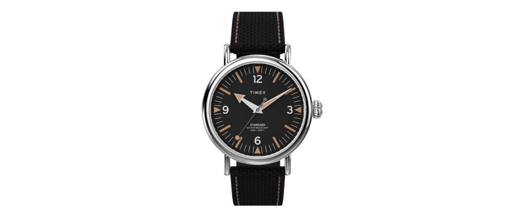
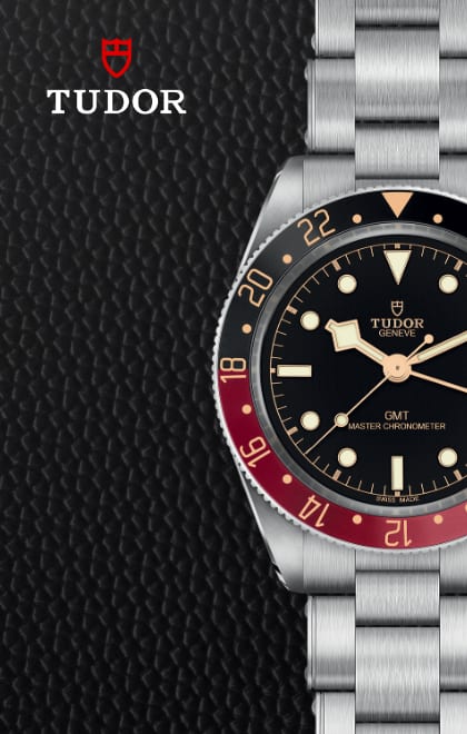
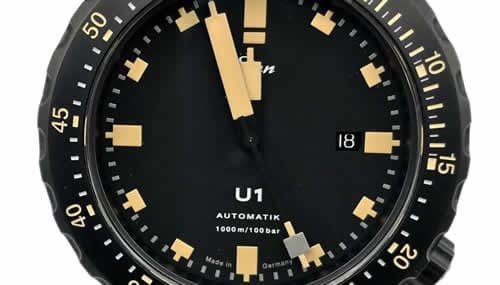
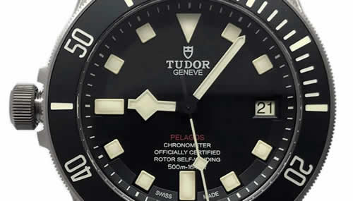
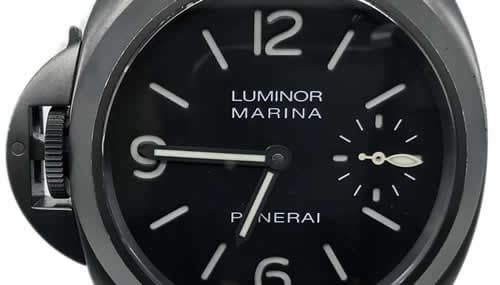
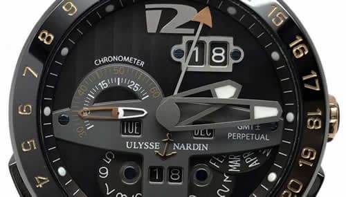
Black represents power, professionalism, strength, and quiet confidence. It’s one of the first classical dial colors, and its versatility suits any formal occasion and casual wear. Having a black dial makes it easier to tell the time, as black dials are almost always accompanied by bright hands that are extremely legible.
Black dials have a sharp sense of commanding authority, as if the wearer knows they are in charge but is too humble to say so. Black dials tend to accompany more modern pieces, encouraging a revolutionary sense of innovation and acting as a mark of the modern age.
Blue
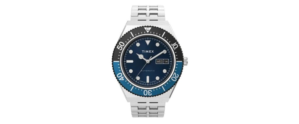
Blue signifies reliability, stability, inspiration, and wisdom. There is an intelligent tone that blue dials carry. They are calming, look elegant and sharp, and are slightly more relaxed than black, white, or silver dials. Watchmakers will typically accompany the color blue with themes of the ocean or sky, modeling the shade after one of the two to give the wearer a story to go with their piece.
Being a primary color, blue goes well with many outfits, making it one of the most popular watch dial colors out there. Often regarded as a newer dial shade, it caught watchmakers’ and enthusiasts’ eyes very quickly with its charm, cementing itself as a timeless color that can signify so much with such a small canvas.
White
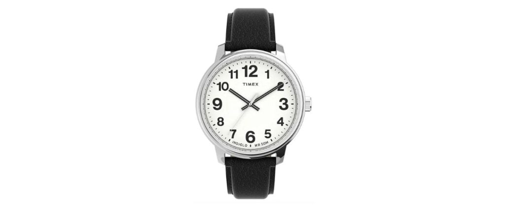
White dials represent elegance, purity, and simplicity. Being universally resounding for all types of jewelry, clothing, accessories, and other types, white signifies versatility and a tranquil aesthetic for anything it accompanies.
Because it’s a neutral color, white is a popular choice for watch dials as it accompanies almost any outfit and is fit to wear in any environment. A crisp, clean, legible view comes at a cost, however.
Like anything colored white, stains or blemishes (or, in this case, scratches or smudges) are extremely noticeable. This could deter some from choosing a white dial, but if you are mindful of the way you treat your piece, then I think you will appreciate the iconic aesthetic a white dial brings.
Silver

Silver dials represent a wide variety. Some associate it with power and authority, while others view it as a symbol of the unknown. It is well regarded as being a very high-end color, which is why it usually accompanies the more pricey pieces.
Like white, it is very legible and sleek, regarded as another one of the most popular dial colors for its simple yet beautiful look. Silver dials perfectly contrast the hands, making them stand out more than other colors and giving them a beautiful backdrop that displays the beauty of both designs.
Gold
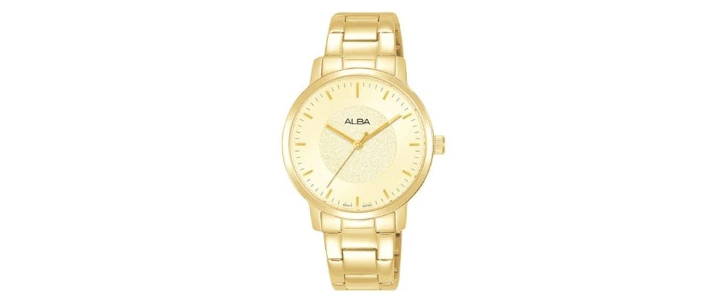
Gold dials represent wealth and opulence. Having a watch made of real gold is one of the most expensive varieties out there. Too much can look tacky, but the right amount can serve for a unique aesthetic that fits the look you’re trying to create.
A well-made gold dial typically applies a thin layer of gold to the surface to give it a warm glow. Yes, bold, but not too bold to overwhelm the piece and make it look flashy. There is a timeless sense of elegance that comes from a gold dial as they often signify the rich history of the piece they accompany.
A “gold watch” is an iconic statement in and of itself, which allures buyers just from the name alone, and while not necessarily everyone’s cup of tea, gold dials definitely have a wide variety of buyers that will eagerly pay for the bold look.
Red
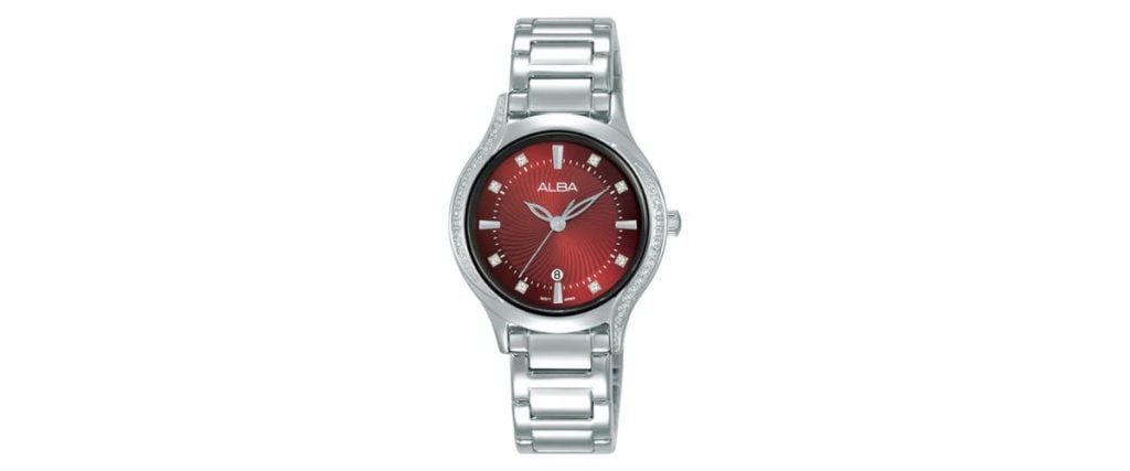
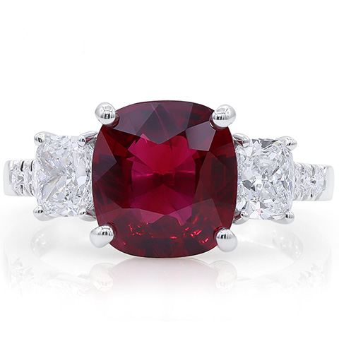
Red dials represent a unique energy and a strong sense of courage and confidence. They are bold and full of flavor. Being one of the brightest dial colors, they will undoubtedly attract eyes, which is what wearers want.
Red represents emotions like love, anger, and passion, and those same emotions are often incorporated into the pieces, invoking a sense of pride in the wearer as they wear their emotions on their wrist. Silver hands and indices pair really nicely with a red dial, bringing out the boldness as they complement each other. Buyers who love bold will be drawn to red.
Green
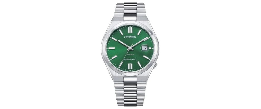
Green symbolizes hope or renewal. Often accompanied by themes of spring, green dials instill a calming sense in the wearer, almost encouraging you to acknowledge the beauty of nature as you admire your piece.
Dark greens are very stylish, giving a sleek and elegant aesthetic, while lighter greens are bolder and invoke stronger emotions. Both preach the same message: that there is tremendous beauty in change and that sometimes uncertainty can lead to something greater than we could have ever imagined.
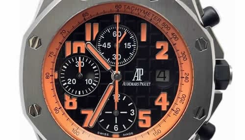
Orange

Orange represents a sense of happiness. It is a warm color and strikes a feeling of enthusiasm in its wearer. Being another bold, bright color, it’s very expressive with its emotions, often holding nothing back. Orange dials—like red—are designed to capture the energy of their wearer, incorporating the realism of human nature while also maintaining the artistic style.
Due to its unique nature and look, it’s a very difficult color to match your wardrobe. If you are interested in purchasing an orange dial, be sure to plan accordingly and wear outfits that compliment the bold nature of your watch.
Yellow

Like red and orange, yellow symbolizes the purest of human emotion. Joy, sunlight, warmth, and comfort are all felt when gazing upon a yellow dial. Arguably, it is one of the boldest choices in watch-wear and one of the rarest as well. If you are looking for something that will make your wrist pop, then look no further. Yellow dials attract eyes far and wide, and on bright, sunny days, they match the tone of the weather extremely well.
The bright nature, as you would expect, makes them very hard to match with. You might be better off just accepting that your wrist is in a realm of its own should you decide to wear a yellow watch. Although I’m sure if you dive into the deepest part of your wardrobe, you’ll be able to style an outfit around your wrist-wear, it will take much longer than any other color.
Which Dial Colors Are Most Popular?
The most popular colors tend to be the more simplistic ones. Black is a classic choice that many would say is the undisputed most popular color. Black goes with everything; it’s not too bold or tacky, and it brings out the watch’s other features to ensure that the whole piece looks spectacular on your wrist.
White and silver go hand in hand and would be considered by others to be the most popular choice for the same reasons as black. It boils down to preference at that point. White and silver—in my opinion—convey their themes more effectively than a black watch, which gives them a few extra points. Also, a white and silver dial combined with a titanium bracelet and case back is one of my favorite combinations that captures everything I love about finely-tuned timepieces.
With all that being said, my personal favorite dial color is blue. The tone that a blue dial sets over the piece is unmatched. It’s rich, sleek, elegant, but not too overbearing. It’s just as popular as black, white, and silver but also aesthetically outperforms them at every turn.
I think it perfectly matches with just about anything in your wardrobe, highlighting even the most low-key outfits and elevating your style quite noticeably. A blue dial paired with a blue bezel simply looks divine. I could go on and on about why blue is my favorite, but I frankly don’t know if I have enough room on the page.
Which Dial Color Is Best for You?
Explore the
Biggest Pre-Owned Collection of Luxury Watches
If you are looking for bold, energetic pieces, lighter colors like red, orange, and yellow are right up your alley. They typically match the wearer’s energy and can be worn on brighter days so that you can experience the full range of their aesthetic prowess.
White, silver, black, and blue—as mentioned before—are the most popular colors. They go with just about anything. Whether you’re at a business party, a formal occasion, or just hanging out with friends, those colors will suit your every need and elevate casual and dressier outfits.
Obviously, you need to match your style according to the color, but it should prove to be quite simple as the colors’ most notable feature would be how easy they are to compliment other aspects of your outfit.
Green and gold can fit into either category. Depending on the shade and how you style them, they could either look bold and vibrant, displaying all of the pristine features, or they can be more relaxed and sleek as you intentionally tone them down to deliver a more unique aesthetic.
I would say that these two colors are the more “wild card” choices as it more heavily depends on how the wearer utilizes them rather than how the watchmaker intended them to be utilized.
Conclusion
Dials are the focal point of your piece. You want to be sure that the one you choose effectively emulates your personal style and tone. Colors are the means by which dials communicate. Everyone’s interpretation of art can differ. That’s why it’s essential that you choose a color you understand and one that understands you. Don’t let what’s “popular” guide your way of thinking. You are the only one who knows your style and the only one who can effectively elevate your wear by choosing a piece that encapsulates all of your best features.
Any well-made watch would be a proficient choice. It’s evident when artists take themselves seriously, and the level of detail watchmakers commit themselves to speaks volumes about their characters and their testimonies as artists. Purchase pieces from makers you trust, and be sure to appreciate the high level of effort and artistic brilliance that goes into every piece.
About Exquisite Timepieces
Established in 1998, Exquisite Timepieces is your one-stop shop for all things luxury watches! We are an authorized dealer for 60+ luxury watch brands including Omega, Hublot, Seiko, & Longines! We are proud to showcase one of the world’s largest pre-owned watch collections, including renowned brands like Rolex and Patek Philippe. Check out our brand new watch arrivals here and popular pre-owned listings here.


