News Archives - Page 5 of 25 - Exquisite Timepieces
Home / Blog / News / Page 5


Category: News

When you find a wristwatch you love, you tend to study every detail—its dial, hands, bracelet, and material. But what if all that information was already compiled for you? In fact, it is. 

Those long, complex sequences of numbers and letters that accompany your favorite luxury watch are called reference numbers. This reference number is a code that holds your watch’s complete story, from its origin to its unique specifications, offering enthusiasts an entire profile at a glance.

Every luxury watch has its own reference number, a unique code that serves not only collectors but everyone involved in the watchmaking and selling process. 

As demand for a variety of styles and brands has surged, these codes have evolved from simple four-digit numbers to more complex sequences—often including letters, slashes, and dashes—to distinguish each timepiece’s individual characteristics.

Decoding reference numbers is like learning a unique language for each brand, with each code telling its own story just as vividly as the watches they represent. 

Reference numbers carry a rich history, tracing the evolution of watch design and branding. This piece will try to explain the rocky road of the reference number and try to simplify the complexities that come with understanding your favorite watch’s distinct code. 

The Importance of Reference Numbers

Reference numbers have become increasingly significant over the years. As time progresses and storied models receive updates or new materials, their reference numbers change to reflect even the smallest modifications. 

In essence, any minor tweak or adjustment results in a new reference number, marking the evolution of each timepiece. This system is essential, offering numerous benefits to manufacturers, sellers, and collectors by ensuring accurate tracking of features, authenticity, and the nuanced history behind each watch.

Every timepiece produced carries a unique reference number to distinguish its specific features—whether it’s the dial color, movement type, or materials used. Take the Rolex Submariner, for instance. 

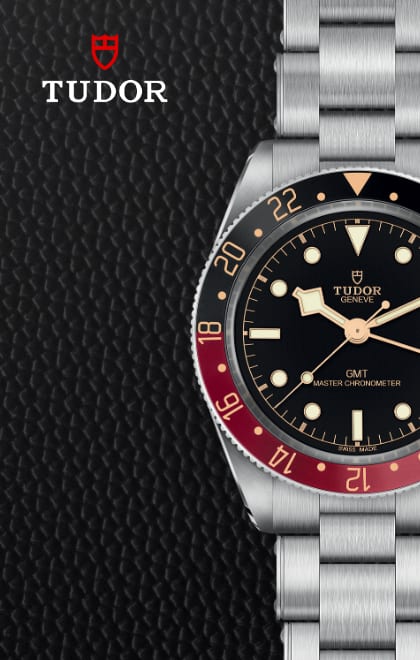
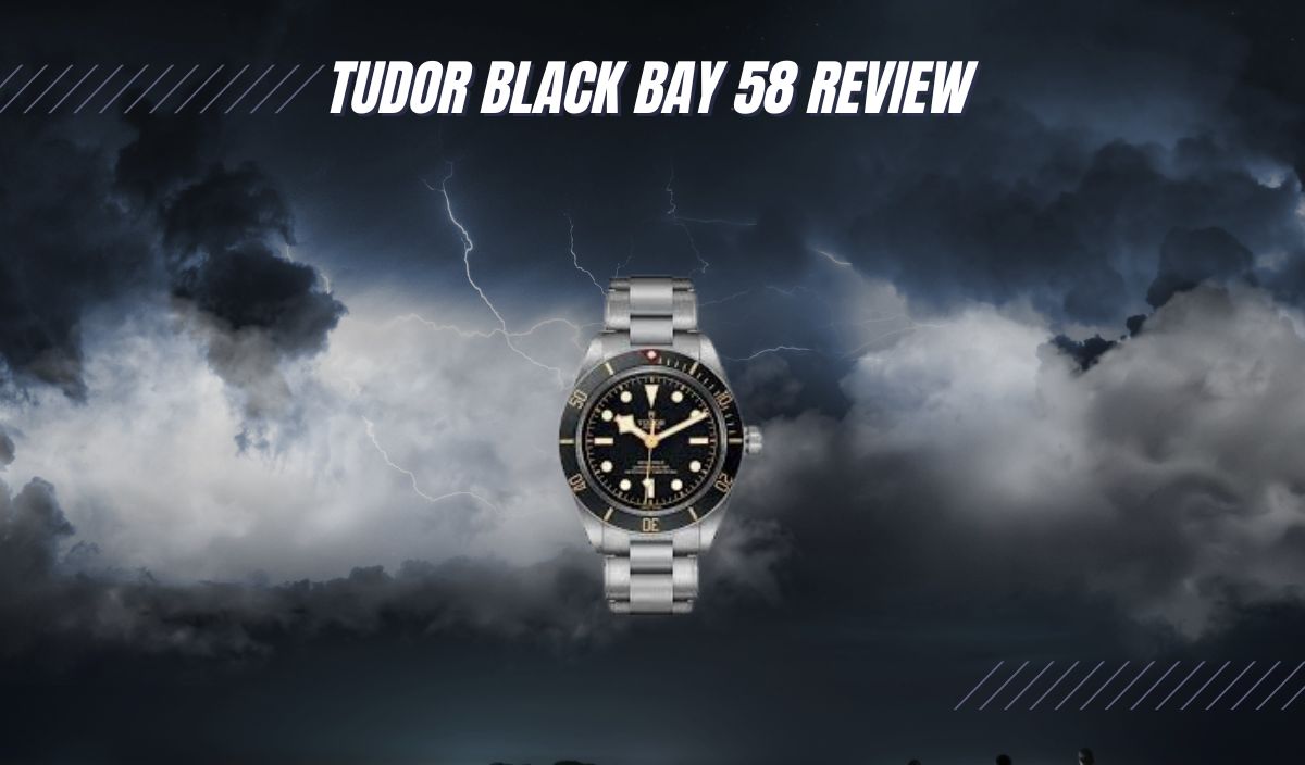
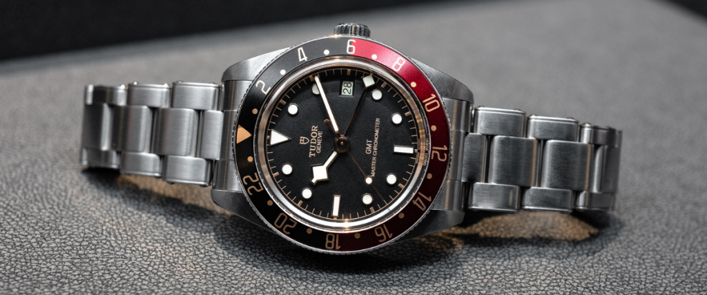
Since its debut in 1953, it has seen numerous iterations, each with a new reference number for updates such as ceramic bezels or advanced calibers. Even a change in the strap can result in a new reference number, as seen with models like the Omega Speedmaster Professional or the Tudor Black Bay 58 GMT. While these variants may be nearly identical, a different strap alone warrants a unique reference, highlighting the precision and attention to detail in watchmaking.

Precise model identification became essential as reference numbers evolved, driven by the need to manage the increasing variety and complexity of watch models. Although watchmaking has long been a craft that forges a nearly sacred bond between humans and time, the volume and diversity of timepieces made it difficult to track each distinct model. 

As a result, computers became integral to cataloging and identifying every watch produced, ensuring a clear, organized system for collectors, sellers, and manufacturers alike. We’ll explore the history of reference numbers shortly, but understanding this evolution is crucial to appreciating their importance today.

The reference number plays a crucial role in authenticating luxury timepieces. As reference numbers became more complex and precise over the years, counterfeit watchmakers also advanced their craft. 

However, despite becoming increasingly similar to the originals, counterfeit watches often carry telltale signs in their reference numbers—illegible fonts, incorrect sequences, or poorly copied characters. 

For collectors and sellers, the reference number remains a key indicator of a watch’s authenticity, helping distinguish genuine pieces from imitations in an increasingly sophisticated market.

For collectors, the reference number is invaluable, revealing the watch’s historical context and often its market worth. As models evolve, specific editions gain popularity—perhaps due to limited production, a significant release event, or the period it represents. These factors can make a watch particularly desirable, transforming it into a valuable investment. 

Reference numbers, in this way, guide collectors in assessing how a watch’s value might appreciate over time. In the resale market, accurate identification and authentication through these numbers become crucial, helping enthusiasts locate specific models and ensuring they’re investing in authentic, sought-after pieces.

History of Watch Reference Numbers

The story of the reference number closely mirrors the evolution of wristwatches themselves. In the 1920s, as pocket watches began to fall out of favor, luxury brands shifted their focus to wristwatches, designing models distributed to a broader market rather than exclusively custom-crafted for individuals. This change turned the wristwatch into a highly sought-after accessory, blending utility with personal style.

Following World War I, when wristwatches surged in demand, Patek Philippe capitalized on the trend by mass-producing and releasing the Calatrava in 1923, identified by reference number 96. 

This simple, double-digit system enabled distributors and manufacturers to easily recognize the model when sourcing and shipping parts for specific watches. Rolex and Omega soon adopted similar numbering systems, opting for four-digit codes that maintained simplicity while allowing for efficient identification.

Brands aimed to simplify the categorization process for distributors by establishing a number system that indicated the essential parts for each model. These reference numbers represented details like case material, dial color, caliber, and complications. 

While there were some similarities across brands, each company used unique specifications in their reference numbers, which created challenges in tracking models accurately—especially for international distributors. This issue persisted for decades until the technological advancements of the 1960s revolutionized the industry, creating more accurate, efficient inventory management worldwide.

The introduction of computers in the 1960s and 1970s brought transformative change to the luxury watch industry, especially in supply chain management. IBM, pioneering in this field, launched the first commercial database systems, marking the end of human-powered distribution and minimizing errors. 

As watch brands embraced this technology, they shifted reference numbers from simple, human-readable codes to more complex sequences optimized for computerized tracking. This evolution in reference numbers allowed manufacturers and distributors to manage inventory with greater precision, making it easier to track every detail without the risk of human error, ultimately enhancing efficiency and consistency across the industry.

By the late 1980s, the human touch in distribution had largely disappeared as machines took on the majority of the manufacturing process. This shift allowed for the creation of longer, more complex reference numbers. 

Watches were now manufactured efficiently and in larger quantities, with reference codes that precisely detailed each model’s specifications, ready for sale as soon as the next day. This era marked a turning point where technology met tradition, reshaping the luxury watch industry and setting the stage for modern watchmaking.

Seasoned collectors might quickly recognize the first few digits of a Rolex or Patek Philippe reference number, but these codes have grown more intricate over time. This evolution isn’t solely due to technological advancements; it’s also a testament to each brand’s commitment to refining its craft through artistic and mechanical innovation. 

As brands introduced new materials, complications, and design nuances, reference numbers expanded to capture these advancements, creating a unique code that reflects both the heritage and continuous evolution within the world of luxury watches.

How to Tell a Watch from its Reference Number

In earlier days, watchmakers relied on shorter reference numbers, usually four to five digits, making identification straightforward. For example, Heuer’s system assigned the first two digits to indicate the caliber, the next for the collection, and the final digit for the case type. 

However, with the advent of technology, brands adopted a new “language” for reference numbers, transforming these simple codes into complex, 13-digit sequences. 

TAG Heuer’s current reference numbering system uses a mix of letters and numbers for precise manufacturing and distribution. Take, for example, the TAG Heuer Carrera Ref. CV2010.BA0786 The initial letters identify the watch collection, CV, meaning the Carrera line. 

The next set of digits indicates the model line and sometimes the movement; in this case, 2010 stands for an automatic chronograph. The final sequence, BA0786, specifies the bracelet type and material. 

Remember how Patek started with only two-digit reference numbers? Patek Philippe has maintained a simpler, four-digit reference system, which continues to serve as a model of clarity. 

For example, the Ref. 5711/1P-001 breaks down as follows: 5711 indicates it is a Nautilus model, 1P signifies the case is made of platinum, and -001 represents the dial color, which in this case is a sunburst grey. 

Omega has continued to stick with just numbers, but their algorithm also changed into longer sequences of code due to the extensive collection of watches. Their reference numbers are organized as such: the Omega Speedmaster Professional Moonwatch Reference: 311.30.42.30.01.005. 

The 311 stands for the collection (Speedmaster), 30 stands for the material (Stainless steel), 42 is the actual case diameter, and the 30 represents the movement being used (Caliber 18610.) The 01 stands for the color dial, which is in its legendary black, and the 005 represents the specific variant of that watch. 

Each brand has developed its own unique language for reference numbers, tailored to help distributors and manufacturers efficiently identify and produce specific models. There’s no universally “right” or “wrong” way to structure these codes—some systems are perhaps easier to understand than others, but each reflects the brand’s needs and history. 

How to Read Rolex Reference Numbers

Like other brands, Rolex has evolved the way it categorizes its reference numbers. The brand transitioned from four digits to six digits due to its extensive collection of models. From the 1970s until the 2000s, Rolex used five-digit reference numbers. 

The shift to a six-digit format helps distinguish newer models, marking updates or changes in design, materials, or movement, and expansion of its timepiece offerings.

With newer models, the first four digits of the reference number represent the model of the watch. For example, the Rolex Submariner Date 126610 LN, a model released in 2020, falls under the 1266- category. These numbers help categorize the model, with variations depending on the specific reference number. 

In some cases, the numbering system traces back to when reference numbers were only four digits long. Regardless, the first two, three, or four digits consistently indicate the model number, helping to distinguish between different collections and iterations within the Rolex lineup.

The last two digits of Rolex’s reference number system denote the bezel type and case material. For the 126610 LN, the “126610” identifies it as a stainless steel model with an engraved bezel. The letters at the end, “LN,” are abbreviations from French: Lunette for bezel and Noir for black, indicating the bezel’s color.

Another example is the iconic Rolex GMT Master II “Pepsi,” reference 126710 BLRO. Here, “1267” places it within the GMT Master II family, “1” denotes the bezel type, and “0” indicates stainless steel. 

The letters “BLRO” signify Bleu and Rouge, the French words for blue and red, referencing the Pepsi-style bezel’s colors. This is a glimpse into Rolex’s structured reference system, each segment detailing the model, material, and color for collectors and enthusiasts alike.

With a variety of different bezels and materials, many different combinations of reference numbers are possible. For a more in-depth guide about the Rolex reference number system, check out SwissWatchExpo’s article on Rolex reference numbers. 

Conclusion

From the inception of the wristwatch, the reference number has evolved alongside it, becoming increasingly sophisticated as watchmaking itself has advanced. Just as technology has enhanced the quality of watches, it has also reshaped the human experience within the industry. 

Today, reference numbers are more than just identifiers—they are symbols of luxury and craft that signify each piece’s unique place in time.  Learning to read a reference number is like unlocking the history behind your favorite piece. 

Though the numbers may read like a line of code, their intricacies reflect the detail within the timepiece itself, establishing the value of the watch you hold.

Dials are undoubtedly the focal point for any watch. They’re engineered to capture the buyer’s attention, flaunting all the aesthetical prowess the maker chooses to put on display. Mechanics aside, sometimes dials are the make-or-break decision when it comes to purchasing a watch. 

Buyers tend to gravitate to what suits them, whether that be bold and flamboyant or stylish and elegant. Variety is the name of the game. Watch-makers know what their buyers want, and they know the significance of a dial’s color. So many master watchmakers incorporate philosophical themes or stoic symbolism in their pieces. 

At its core, this design choice starts with the dial color. Watches meant to mimic the ocean tend to have blue dials, and ones meant to mirror freshly fallen snow in a forest tend to be white. The color scheme of a dial preaches more than just aesthetical literacy. It communicates the message the artist is trying to relay through their creation. 

As we explore how each color portrays that message to their wearer, keep in mind that everyone’s preferences differ. What stands out to you may not stand out to someone else. The beauty in diversity is that—whether you realize it or not—everyone has a piece out there that speaks to them. 

The Meaning Behind Different Watch Dial Colors

Think of watch dials as a painter’s canvas. Artists love to preach to their audience in ways that often go unnoticed. A watch dial essentially follows the same principle. Different colors mean different things, and they communicate in ways that many wearers miss. 

Black  

Black represents power, professionalism, strength, and quiet confidence. It’s one of the first classical dial colors, and its versatility suits any formal occasion and casual wear. Having a black dial makes it easier to tell the time, as black dials are almost always accompanied by bright hands that are extremely legible. 

Black dials have a sharp sense of commanding authority, as if the wearer knows they are in charge but is too humble to say so. Black dials tend to accompany more modern pieces, encouraging a revolutionary sense of innovation and acting as a mark of the modern age.  

Blue

Blue signifies reliability, stability, inspiration, and wisdom. There is an intelligent tone that blue dials carry. They are calming, look elegant and sharp, and are slightly more relaxed than black, white, or silver dials. Watchmakers will typically accompany the color blue with themes of the ocean or sky, modeling the shade after one of the two to give the wearer a story to go with their piece. 

Being a primary color, blue goes well with many outfits, making it one of the most popular watch dial colors out there. Often regarded as a newer dial shade, it caught watchmakers’ and enthusiasts’ eyes very quickly with its charm, cementing itself as a timeless color that can signify so much with such a small canvas. 

White 

White dials represent elegance, purity, and simplicity. Being universally resounding for all types of jewelry, clothing, accessories, and other types, white signifies versatility and a tranquil aesthetic for anything it accompanies. 

Because it’s a neutral color, white is a popular choice for watch dials as it accompanies almost any outfit and is fit to wear in any environment. A crisp, clean, legible view comes at a cost, however. 

Like anything colored white, stains or blemishes (or, in this case, scratches or smudges) are extremely noticeable. This could deter some from choosing a white dial, but if you are mindful of the way you treat your piece, then I think you will appreciate the iconic aesthetic a white dial brings. 

Silver 

Silver dials represent a wide variety. Some associate it with power and authority, while others view it as a symbol of the unknown. It is well regarded as being a very high-end color, which is why it usually accompanies the more pricey pieces. 

Like white, it is very legible and sleek, regarded as another one of the most popular dial colors for its simple yet beautiful look. Silver dials perfectly contrast the hands, making them stand out more than other colors and giving them a beautiful backdrop that displays the beauty of both designs. 

Gold

Gold dials represent wealth and opulence. Having a watch made of real gold is one of the most expensive varieties out there. Too much can look tacky, but the right amount can serve for a unique aesthetic that fits the look you’re trying to create. 

A well-made gold dial typically applies a thin layer of gold to the surface to give it a warm glow. Yes, bold, but not too bold to overwhelm the piece and make it look flashy. There is a timeless sense of elegance that comes from a gold dial as they often signify the rich history of the piece they accompany. 

A “gold watch” is an iconic statement in and of itself, which allures buyers just from the name alone, and while not necessarily everyone’s cup of tea, gold dials definitely have a wide variety of buyers that will eagerly pay for the bold look. 

Red 

Red dials represent a unique energy and a strong sense of courage and confidence. They are bold and full of flavor. Being one of the brightest dial colors, they will undoubtedly attract eyes, which is what wearers want. 

Red represents emotions like love, anger, and passion, and those same emotions are often incorporated into the pieces, invoking a sense of pride in the wearer as they wear their emotions on their wrist. Silver hands and indices pair really nicely with a red dial, bringing out the boldness as they complement each other. Buyers who love bold will be drawn to red. 

Green

Green symbolizes hope or renewal. Often accompanied by themes of spring, green dials instill a calming sense in the wearer, almost encouraging you to acknowledge the beauty of nature as you admire your piece. 

Dark greens are very stylish, giving a sleek and elegant aesthetic, while lighter greens are bolder and invoke stronger emotions. Both preach the same message: that there is tremendous beauty in change and that sometimes uncertainty can lead to something greater than we could have ever imagined. 

Orange

Orange represents a sense of happiness. It is a warm color and strikes a feeling of enthusiasm in its wearer. Being another bold, bright color, it’s very expressive with its emotions, often holding nothing back. Orange dials—like red—are designed to capture the energy of their wearer, incorporating the realism of human nature while also maintaining the artistic style. 

Due to its unique nature and look, it’s a very difficult color to match your wardrobe. If you are interested in purchasing an orange dial, be sure to plan accordingly and wear outfits that compliment the bold nature of your watch. 

Yellow

Like red and orange, yellow symbolizes the purest of human emotion. Joy, sunlight, warmth, and comfort are all felt when gazing upon a yellow dial. Arguably, it is one of the boldest choices in watch-wear and one of the rarest as well. If you are looking for something that will make your wrist pop, then look no further. Yellow dials attract eyes far and wide, and on bright, sunny days, they match the tone of the weather extremely well. 

The bright nature, as you would expect, makes them very hard to match with. You might be better off just accepting that your wrist is in a realm of its own should you decide to wear a yellow watch. Although I’m sure if you dive into the deepest part of your wardrobe, you’ll be able to style an outfit around your wrist-wear, it will take much longer than any other color. 

Which Dial Colors Are Most Popular?

The most popular colors tend to be the more simplistic ones. Black is a classic choice that many would say is the undisputed most popular color. Black goes with everything; it’s not too bold or tacky, and it brings out the watch’s other features to ensure that the whole piece looks spectacular on your wrist. 

White and silver go hand in hand and would be considered by others to be the most popular choice for the same reasons as black. It boils down to preference at that point. White and silver—in my opinion—convey their themes more effectively than a black watch, which gives them a few extra points. Also, a white and silver dial combined with a titanium bracelet and case back is one of my favorite combinations that captures everything I love about finely-tuned timepieces. 

With all that being said, my personal favorite dial color is blue. The tone that a blue dial sets over the piece is unmatched. It’s rich, sleek, elegant, but not too overbearing. It’s just as popular as black, white, and silver but also aesthetically outperforms them at every turn. 

I think it perfectly matches with just about anything in your wardrobe, highlighting even the most low-key outfits and elevating your style quite noticeably. A blue dial paired with a blue bezel simply looks divine. I could go on and on about why blue is my favorite, but I frankly don’t know if I have enough room on the page. 

Which Dial Color Is Best for You?

If you are looking for bold, energetic pieces, lighter colors like red, orange, and yellow are right up your alley. They typically match the wearer’s energy and can be worn on brighter days so that you can experience the full range of their aesthetic prowess. 

White, silver, black, and blue—as mentioned before—are the most popular colors. They go with just about anything. Whether you’re at a business party, a formal occasion, or just hanging out with friends, those colors will suit your every need and elevate casual and dressier outfits. 

Obviously, you need to match your style according to the color, but it should prove to be quite simple as the colors’ most notable feature would be how easy they are to compliment other aspects of your outfit. 

Green and gold can fit into either category. Depending on the shade and how you style them, they could either look bold and vibrant, displaying all of the pristine features, or they can be more relaxed and sleek as you intentionally tone them down to deliver a more unique aesthetic. 

I would say that these two colors are the more “wild card” choices as it more heavily depends on how the wearer utilizes them rather than how the watchmaker intended them to be utilized. 

Conclusion

Dials are the focal point of your piece. You want to be sure that the one you choose effectively emulates your personal style and tone. Colors are the means by which dials communicate. Everyone’s interpretation of art can differ. That’s why it’s essential that you choose a color you understand and one that understands you. Don’t let what’s “popular” guide your way of thinking. You are the only one who knows your style and the only one who can effectively elevate your wear by choosing a piece that encapsulates all of your best features. 

Any well-made watch would be a proficient choice. It’s evident when artists take themselves seriously, and the level of detail watchmakers commit themselves to speaks volumes about their characters and their testimonies as artists. Purchase pieces from makers you trust, and be sure to appreciate the high level of effort and artistic brilliance that goes into every piece.

Okay, listen up, people. Today, we are going to learn about a small, sometimes overlooked, but extremely important part of a mechanical watch. Some of the less horologically educated among you may call it a “winder” or “that twisty thing on the side”. Like every other part of a watch, it has a proper name. It is called the crown, and, as you will see, that’s a fitting name. 

The crown is easy to spot on a watch. It’s usually a round knob and generally found at the 3 o’clock position. This makes it easy to wind for a right-handed person because they can hold the case in their left hand and wind with the right. 

By the way, never wind or set your watch while it’s on your wrist. You could easily bend the stem of the crown and cause damage that can be pretty expensive to have fixed.

There are watches with the crown at 9 o’clock. These are left-handed watches for obvious reasons. Some right-handed people like them, too, because they don’t have to deal with the crown digging into the back of their left hand while bending it. Lefties are not common, but they are out there.

Watches with crowns at 4 o’clock also exist. In fact, there are even two and three-crown timepieces. You won’t have any trouble identifying the crown. Let’s take a look at how they function.

How Watch Crowns Work

The crown is technically part of the movement and the only part of it that you can touch. Its main function is to wind the mainspring, which is what powers a mechanical watch. You turn the crown clockwise until you feel resistance. On most watches, this is about 30-40 turns, which means the mainspring is fully wound.

The crown is attached to a stem that runs through the case into the movement. A system of gears engage when the crown is turned and wind the spring. The crown performs other functions as well.

Displaying the correct time is essential to a watch. The crown will have a position that allows you to turn the crown to move the hands forward or back to set the time. On a basic three-hand watch with no complications, there will only be one position. 

Pull out to set the time, push back when you’re done. Many watches have a hacking function that stops the second hand when the crown is pulled out. This allows you to synchronize your watch to the exact time. I like to set mine using my cell phone.

Watches with complications such as date, day of the week, GMT, or moonphase have added positions to allow you to set them with the crown. 

For example, you pull out to the first position to set the date. Some watches change the date when you turn in one direction and a different complication, such as the GMT hand or the day of the week when you turn in the other. 

A handy feature some watches have is a position that just moves the hour hand. I have this on my Omega Seamaster, and it’s great when you travel to a different timezone or have to adjust to semi-annual time changes. 

Watches that have more than one crown assign a different function to each crown rather than having multiple positions. 

The crown of a watch also adds to its aesthetics. It will be designed to match the case, style, and type of watch. There are usually grooves to make it easy to grip. Some crowns have a precious stone on them to bling the timepiece up a bit. Now that we know about the many functions of a crown let’s see how they evolved. It didn’t happen overnight. 

History of Watch Crowns

There was a time before crowns existed. Pocket watches were wound with a key that was inserted into the dial or case. If you’ve ever seen an antique clock, you know what that looks like. This was inconvenient for a watch because if you left the key at home or lost it, you could not wind or reset your watch.

A watchmaker in England, John Arnold, is credited as the first to find a solution to this problem. He placed a knob on a pocket watch that could wind the mainspring. Later, in 1830, the legendary Antoine-Louis Breguet refined Arnold’s mechanism, which allowed it to be used on smaller watches, such as those worn on the wrist.

A decade or so later, in France, Jean Adrien Phillipe, co-founder of Patek Philippe, developed a sliding pinion that brought the crown closer to the modern one we know today. It allowed for different positions and multiple functions. 

We should note that the crown didn’t always have such a regal name. It was originally called a knob. Not so elegant but over time, watchmakers noted that the shape resembles the headwear of royalty. That coupled with the fact that on pocket watches, the crown sat at 12 o’clock or on the “head” of the case, and the familiar moniker of crown was applied and stuck for good. 

As newer complications were developed and added to watches, the crown was further developed to allow the wearer to set these features. Several different types of crowns were also invented. 

Types of Watch Crowns

There is more than one type of watch crown, and if you have even a small collection, you probably own watches with more than one type. These types were created to serve different purposes in various watch types.

Screw-Down Crowns

My favorite type of crown is the screw-down. As the name implies, the base of the crown is threaded, and it screws down into the case. This creates a seal that is essential to high-water resistance timepieces such as divers. If the crown doesn’t screw down, it’s not a dive watch. A screw-down crown is a highly desirable feature, even if you don’t plan to wear your watch in water. 

The screw-down also keeps dust and other debris from getting into your movement and damaging it. Screw-down crowns have multiple positions on watches with complications, and you must unscrew them to pull the crown out before winding or setting.

Push-Pull Crowns

The most basic type of crown is the push-pull. It simply pulls out and pushes back in with no unscrewing necessary. These are typically found on dress watches because of their simple and elegant design. They will have multiple positions if necessary and are easy to use.

Recessed Crowns

Recessed crowns sit down partly in the case. This gives the watch clean lines and a pretty aesthetic. You also don’t have to worry about the crown digging into the back of your wrist. The downside is that they can be tricky to turn, and that may get a little annoying.

Multiple Crowns

As mentioned earlier, there are watches with more than one crown. Two-crown watches generally have them located at 2 and 4 o’clock, while three-crowns have them at two, three, and four. The extra crowns perform the function of adjusting other complications making fewer crown positions necessary. 

There are other knobs or buttons you may see protruding from a watch case that are not actually crowns. As I look down at my wrist, I see one now. The infamous helium escape valve on the Omega Seamaster. 

Its purpose is to let helium escape from the case on extended saturation dives, which makes it not at all necessary for the vast majority of watch lovers. Many people hate it, but I think it adds to the cool factor.

Chronographs usually have buttons at 2 and 4 o’clock that start and stop the stopwatch and reset it, respectively. I have a multi-function watch with this same setup. It’s a quartz movement, so it needs no winding. The crown sets the time, and the two buttons advance dials display the day and date. 

How Important is a Watch Crown?

The importance of a watch crown cannot be overstated. If you can’t wind the mainspring on a mechanical watch, when it stops, it’s useless. Even an automatic needs to be wound from time to time.

Setting the time is always a necessity. Even the most accurate mechanical timepieces gain or lose a bit of time each day. Eventually, that means a reset, and switching to and from Daylight Savings Time means adjusting your watch with the crown. Unless you have a GMT, you need to adjust your watch when traveling to different time zones. 

A date complication needs to be adjusted at the end of every month with less than 30 days. The functions of this tiny part of a watch are essential to its usefulness. Sure, you could avoid all this with a smartwatch, but where’s the fun in that?

Conclusion

A watch is a complex piece of mechanical engineering with many moving parts. Some you can’t see, and some you can. Most will only ever be touched or repaired by your friendly neighborhood watchmaker. 

The crown, small though it is, is your opportunity to adjust, power, and interact with your precious wrist babies. The next time you wind your watch, take a moment to appreciate all that your crown does for you.

Watch lume is bright, fun, and very useful. It feels like it’s been around forever. In fact, it’s easy to take watch luminosity for granted. But think about how indispensable a material like this would have been in the early days before electricity was a thing in homes! 

Back then, all people could do was rely on audible features like those that chimed to tell the time. And even then, you had to be wealthy enough. Sonnaires and minute repeaters weren’t cheap by any stretch of the imagination! 

It was the 20th century that birthed the idea of a watch that could be read in the dark. That being said, the road wouldn’t be easy. In fact, watch luminescence has quite a murky back story… 

The Shady History of Lume  

Now, you may have heard of Polish physicist Marie Curie. She was the first and only female to win the Nobel Prize, not once but twice, but she also happened to be the leading chemist in the field of radioactivity. 

During her ground-breaking, history-defining work, she discovered two important elements: polonium and radium. The latter was radioactive and is a significant topic to cover when researching the history of watch luminosity. It was the first luminous material to find its way onto wristwatches during the early 1900s. 

To emphasize the seriousness of this radioactive element, it’s important to touch on the untimely death of Marie Curie herself, who passed away from symptoms related to prolonged exposure to the one material she revolutionized. 

We know of the effects of radioactivity now, but during radium’s heyday in watchmaking, the research simply wasn’t there. Sadly, we’d come to realize the damaging effects of this material on human health over time, but not before it was too late. 

Ironically, as is the case with many harmful chemicals, we once thought radium was good for us. Can you imagine? Just like smoking cigarettes, initially advertised as a relaxant and a healthy lifestyle choice – radium was historically considered an enhancement to human health rather than a hindrance.

Radium hair treatments were sold during the 1920s as luxurious products to indulge in, and those working in watchmaking facilities who were tasked with the job of applying radium to watch dials knew no better at the time. 

Named “The Radium Girls”, these female technicians would lick the tip of their paintbrush to achieve a finer point for radium application on the more delicate elements of a watch dial or clock display. 

Sadly, over time, watchmakers began realizing the effects that prolonged exposure to radium had on human health. The Radium Girls would experience several horrific symptoms such as their teeth falling out, pain around their face and head, and fatigue. 

Long-term exposure to the luminous material would even cause ”Radium Jaw” where the jawbone would weaken to the point at which it would crumble. These weren’t the only devastating side-effects of working with radium, either. Many women would go on to suffer from cancer.

Industry giant Rolex was using radium before the 1950s, right up until around 1963. The brand is a great example to research if you want to follow the evolution of watch lume in chronological order and visually see how watchmakers have adapted to the changes in luminous material over the decades.

Between the mid-1960s and up to around 1997, Rolex switched from radium to tritium (another material we’ll cover in detail shortly) before moving onto Super-LumiNova (naming it Chromalight). One reason for the switch to the more recent Super-LumiNova material was down to tritium’s short shelf life. 

The material would only last for around 12 years and would begin developing a patination that connoisseurs didn’t like. Ironically, the old radium-style luminosity and faded tritium dials are now a desirable feature in a watch, which many enthusiasts will pay considerable money for.

Since Super-LumiNova joined the scene in around 1997-1998, there have been a handful of iterations of the material. Several brands have created their own version of Super-LumiNova. Examples include Rolex’s proprietary Chromalight material and Seiko’s Lumibrite. Oh, and one other thing – Super-LumiNova isn’t radioactive at all, hence its popularity!

How does Watch Lume Work 

Lume is the term given to the luminescent material used on a watch dial to make it glow in dark conditions. It’s an integral feature for any tool or sports watch since it serves a very practical purpose, guiding the way to accurate, legible timekeeping when you may need it most. 

It, therefore, goes without saying that watch lume is particularly important for those who wear their watch to work at night or for outdoor exploration in particularly challenging conditions and harsh environments. The debate surrounding which brand offers the strongest lume is ongoing, but what we do know is how it works.

Since there are different forms of watch lume, how it works depends on whether you’re looking at photoluminescent material, electroluminescent material, or tritium gas tubes. 

While photoluminescent material absorbs light energy and emits a glow, electroluminescence is what you’ll likely see on the backlight of a digital or ana-digi watch. We’ll go through the various types of watch lume in this article and identify how each one differs from the other.  

What is Radium?

As mentioned, one of the revolutionary breakthroughs in luminescent material on watch dials came about during the time of the First World War. Soldiers began replacing their pocket watches with wrist-worn instruments and needed to depend on something concise and clear. Flashlights were forbidden since they would instantly give away a hidden location—cue luminous watch dials.

One of the first examples of a radium watch dial was the Radiomir watch developed by Florentine-based watchmaker Panerai. The Parisian company specialized in diving gear and precision instruments for the Italian Navy. 

The material in question was made from radium bromide, zinc sulfide, and mesothorium. After the hazardous effects of radium became common knowledge, however, the industry turned its attention to something safer. Tritium.

Today, the Radiomir watch by Panerai is still going strong, albeit without the harmful effects of radioactive material splashed all over its dial. Panerai combines Super-LumiNova features with a dial design that strays very little from the original and equips these watches with impressive power reserves (some of which last for up to 8 days). 

The Panerai Radiomir Black Seal 3 Days PAM00505 is a great example of a watch that fuses modern materials and technology with a classic, vintage-esque charm. For example, the Arabic numerals at the cardinal points on the dial are all finished in a beige-colored Super-LumiNova. This gives the watch an old-radium charm and a character that collectors adore.

Enter Tritium

Before we talk too much about Tritium, it’s worth mentioning a material called Promethium. Promethium played an integral role in the evolution of watch lume, even though it’s rarely mentioned or recognized in industry dialect today. 

Promethium replaced radium for a short period of time as a safer alternative. Yet, this less-radioactive material had a much shorter lifespan than the former. Promethium only lived for around two and a half years. 

When you compare this to radium’s 1600 years of life, you can soon see why this material never came close to the reliability and legibility of radium. Still, it didn’t cause people’s teeth to fall out and certainly carved a road for tritium. 

Tritium (H-3) was used directly on the surface of watch dials until the mid-1990s, and there were several pros and cons to using it as a luminous material. Firstly, it offered a better lifespan than Promethium. Tritium could last for around 12.5 years as opposed to Promethium’s 2.5 years. 

Sounds great, right? But there’s a downside. This material wasn’t entirely safe. Tritium is a beta-emitter. It’s safer than radium, but it’s still a radioactive isotope of Hydrogen, which, as a paint, had a way of seeping through the plastic caseback and diffusing through to the wearer’s skin.

To overcome this, brands began replacing the paint with gaseous tritium light sources. Ever heard of Ball Watch Company’s Light Emitting Technology? Right! So, these tightly sealed tubes safely store tritium and contain a phosphorus powder coating on the inside, which reacts with tritium when it releases electrons. 

Ball’s luminous technology is second to none in the field of luminous gas tubes. They’re small, precise, and lightweight. The company produces them using a CO2 laser before meticulously positioning them into place.

Perhaps no Ball Watch showcases the manufacturer’s expertise in this light tube technology more than the Engineer III Marvelight Chronometer Meteorite watch. The steel model, complete with a matching steel bracelet and a sapphire crystal glass front, is an automatic three-hander with rainbow-colored gas tubes that illuminate the hour markers and hands in dark conditions. 

If the meteorite dial wasn’t enough of a unique feature alone, the orange, pink, blue, green, and yellow indices put on a spectacular show after dark. With 100-meter water resistance and antimagnetic capabilities that protect the watch from up to 80,000 A/m, the Engineer III is a watch that has so much more going for it than the luminosity of its dial alone. 

Still, you can’t deny that the powerful presentation of those rainbow hour markers is certainly the star of the show at nightfall. 

Photoluminescence: Super-LumiNova 

Super-LumiNova actually takes its name from the brand that founded it back in 1993. The material is made up of strontium aluminate and photoluminescent pigments that are mixed together to form a non-toxic, luminous paint that glows beautifully in the dark. 

It differs from the tritium-filled gas tubes you see on a Ball watch since the latter is more a chemical reaction that causes a continuous glow, day or night. Super-LumiNova, however, glows at a level of brilliance that is unmatched but for a period of time only and creates an eye-catching spectacle that you can observe in any low-light environment.

If you consider yourself a modern watch collector, you’ll have heard the term Super-LumiNova creep up in conversations or even seen it listed in the spec details of most watches online. Super-LumiNova is a photoluminescent material, which means it absorbs light before emitting a long-lasting, brilliant glow. 

It succeeded the former LumiNova material, which became the go-to material to use after tritium. Surprisingly, the material was first discovered back in the 1960s and was used in cathode ray tubes. However, it was much later before the watch industry embraced the fluorescent qualities of LumiNova.

This non-radioactive substance poses no threat to human health, making it a no-brainer for modern tool watches. The only downside to Super-LumiNova is that it needs to be charged with sufficient light before it will glow for a limited period of darkness. 

Therefore, if a watch is left in a dark drawer, it will need charging before you can expect to see a gleaming dial at night. Its intensity also decreases over time once charged. The material’s quality and the light source’s intensity determine how well a dial stays illuminated, especially since the duration of a Super-LuiNova-coated dial can vary from half an hour to 15 hours.

One of the key advantages of Super-LumiNova is that it can charge and recharge an unlimited amount of times and share no wear and tear. Unlike radium and tritium, which degrades over time, this more modern material has a much longer lifespan. It’s also available in a plethora of different colors!

Of course, one of the most common variations of Super-LumiNova is Seiko’s Lumibrite material, which is widely featured throughout the brand’s dive watch range. Entirely safe for humans and based largely on the more famous Super-LumiNova material, Lumibrite contains zero toxic ingredients and is free from radioactive substances. 

Since it works in the same way as the more common LumiNova, Lumibrite effectively absorbs light and then stores it before radiating a strong and impressive glow that can last up to 5 or 6 hours or more.

The Seiko Prospex Alpinist is one of the brand’s most collectible adventure watches, with a history intrinsically linked with alpine pursuits. In 2020, it became part of the Prospex collection, with models like the SPB121 now representing some of the brand’s finest examples. 

This model reimagines the original 1951 sports watch with an inner rotating compass, robust steel case, scratch-resistant sapphire crystal, Lumibrite hour markers, and cathedral hands.

Electroluminescence; a Glow with an Electrical Flow

So, we know that photoluminescent materials absorb light energy before emitting a rich glow. Electroluminescence is when light is produced as a result of an electrical current passing through a phosphorus material. 

In watches, an electric conductor-coated plastic or glass panel is mounted behind the dial, and when a button is activated, it delivers an electrical current. The phosphor reacts and acts as a backlight. One of the most common examples of this technology can be found in Timex’s famous Indiglo watches, but other affordable watch companies use it, too, like Casio. 

The rugged Casio G-Shock Mudmaster is an ana-digi watch with bucket loads of wrist presence thanks to a powerful 52mm resin case. 

Rugged and durable, its robust exterior packs a whole load of functionality into the wrist, including double LED lights, a Location Indicator feature, 200 meters of water resistance, solar power charging, and features that also measure altitude and barometeic pressure. 

Additional features include a mission log, world timezones, phone finder, alarms, and, of course, a backlight, combined with luminous material on the analog details for traditional timekeeping. 

Watch Lume – Just How Important Is It?

You only need to watch a YouTube video or two to see just how ga-ga collectors go over a watch with lume. You’ll see shots of it completely in the dark for full effect, while watch modders may even try their hand at painting it on a dial if they’re feeling extra adventurous. 

Considering Super-LumiNova is no more than the horological version of glow-in-the-dark paint, it’s only natural to question why enthusiasts love it so much. But they do, and that’s partly to do with how important it is on a functional level.

Admittedly, when a watch dial is fully charged, a Super-LumiNova watch has a captivating effect on its wearer, especially if done right. So, you can imagine the appeal of a fully lumed dial. The likes of Bell & Ross, DOXA, IWC, TAG Heuer, and Zodiac have all dabbled in this field. Heck, even affordable solar-power specialists Citizen have dipped their toe in fully lume dials! 

But whether a fully-coated dial or not, you’re always going to want to read the time in the dark. Case in point, there is always a need for lume on a practical watch, but should it always be a deliberate consideration? 

Absolutely not. Even the geekiest of watch lume nerds will agree that there is a style and a design that calls for Super-LumiNova, and it would certainly look out of place on an elegant 18k dress watch.

Conclusion

Sometimes, it can feel like manufacturers are just ticking a box when adding features like Super-LumiNova to a watch, but as long as a timepiece is the sporty, functional, practical type – it will always serve a useful purpose. 

Being able to read the time while hundreds of meters under the ocean’s surface, while out fishing at night, while mountain climbing, cave exploring, or navigating the skies in the dead of night – watch luminosity will always have a place on the dial of a good quality tool watch.

It seems that every time I talk about Grand Seiko, I spend all my time raving about their elegance and innovation, praising them for their craftsmanship and attention to detail. They have managed to capture the essence of watchmaking and seem to personally inject whatever secrets they hold into each and every piece. The Grand Seiko SLGW003 is a striking testament to this philosophy. 

Part of the Evolution 9 collection, the SLGW003 is a relatively newer entry to the iconic family that houses so many recognizable names. It comes equipped with the Grand Seiko Caliber 9SA4, the first manual-winding 36,000 vph mechanical movement Grand Seiko has created in nearly 50 years. 

They incorporate the manual design to forge a deeper connection between the watch and the wearer, claiming that the ritual winding of a watch is one of life’s pleasures. In the 60s and 70s, Seiko produced numerous manually wound pieces, attempting to deliver higher precision to each design. 

This watch signifies their grand return to these more old-fashioned pieces, but not without improving upon the original design, displaying their drive to always increase their level of craftsmanship. 

Wrapped in a shroud of sophistication with the advanced technology of the modern age, the SLGW003 delivers on all fronts, ensuring that the wearer looks their best while being easy to read, wind, and wear. 

History

Released in 2021, the Grand Seiko SLGW003 immediately made a name for itself among the Evolution 9 collection. Drawing inspiration from Japan’s rich cultural heritage and birch forests that reside near the Grand Seiko headquarters, this watch embodies the striking beauty of Japanese nature, as well as the detail-oriented precision of Japanese society. 

Taking inspiration from the old manually wound 10-beat designs from the ’60s and ’70s, this watch could be considered both a throwback and a step forward. It incorporates old themes and new functions that excel in practicality and leave the wearer in awe of its mechanical prowess.

Case 

Titanium cases are among my favorite materials. Lightweight, sleek, luminescent, and subtle, they satisfy every desire and check every box when it comes to the beauty of your pieces’ case. Grand Seiko’s hard titanium comes with all the benefits of regular titanium, incorporating a beautiful Zaratsu polishing that only adds to the beauty. 

The diameter is 38.6mm, the lug-to-lug is 45.0mm, and the thickness is 9.95mm, measuring very thin all across the board. The contorted lugs help with wearability and give it an even slimmer aesthetic, which will appeal to many of you who prefer the sleeker designs. 

The Zaratsu finish accompanies both the inner crease and the bezel, while matte finishing accompanies the sides of the case. The sapphire crystal protects the dial while rising slightly above the rest of the case due to it being slightly domed. The casing has been made with a low center of gravity to ensure that it still sits securely on your wrist, no matter how light it is. 

The crown protrudes from the three positions, proudly embroidered with the GS logo. And when you turn the case around, you are met with the welcomed surprise of an open case-back so that you can view the mechanical integrity of the piece.

The case exemplifies an understated charm, reinforcing the significance of the watch’s other features while also catching the wearer’s eye with its beautiful titanium elegance. Successfully designed casing exists for two significant reasons: First, it has to look aesthetically pleasing by itself, but the most important reason is that it has to elevate everything around it. 

The beauty of the watch starts with the casing. It serves as a foundation around which the other features center themselves. Grand Seiko has delivered an effective foundation and, by using its staggering beauty, has crafted one of its most impressive pieces yet.

Dial

The dial is highly textured with a unique white birch tree bark style that is unique to this series. While at first, it may seem familiar, as the SLGH005 appears very similar to the Grand Seiko SLGW003, the white birch pattern has far more textures on the SLGW003, and the pattern is moving horizontally on the SLGW003 as opposed to vertically on the SLGH005. 

The bezel seems to focus on giving the watch a dressier appeal as the textures breathe an unprecedented style of luxury and pristine craftsmanship that is far more detailed than anything we’ve seen before. 

Other than the Grand Seiko logo and the text at 6 o’clock, there are no complications in the dial, ensuring that the wearer is satisfied with the symmetry and cleanliness that the dial seeks to emulate.  

The indices are broad and easy to read, taking the common shape of the Series 9 style. They are polished to perfection and give a beautiful complementary look to the backdrop of the dial, standing out from the birch-wood background in an elevated manner. 

The same goes for the hands. When everything on the dial is the same color, it tends to blend together. This piece brings out a stark boldness to each feature while keeping them all the same shade. Nothing seems out of place or distracting. The hands are elegant and slender, which goes well with the size of the piece itself. 

This is one of the cleanest dials we’ve seen from Grand Seiko, and it is among my personal favorites. The birch-wood texture’s underlying simplicity and the titanium’s elegance seem to be a combination sent from heaven to give us one of the most extraordinary designs. The removal of a date window does many favors for the integrity of the dial as well. 

Part of the beauty comes from the symmetry, and I feel like if you tried to fit anything else in the dial, then it would undermine the original vision. Skilled watchmakers know when to restrain themselves. 

Sometimes, less is more, and Grand Seiko seemed to go into this project with that idea in mind. I would say it worked very well for them, and I’m eager to see if they replicate this design choice in any future pieces. 

Movement

Engineered with the sole purpose of providing the ultimate hand-winding experience, the Caliber 9SA4 comes with a pleasing winding sound, demonstrating its craftsmanship and quality. It has a high frequency of 10 vibrations per second, which accounts for the 80 hours of power reserve

This is the first hand-wound, high-beat movement that Grand Seiko has produced in more than 50 years, and given how they treat the rest of their works, you can be sure that the 9SA4 has been finely tuned and perfected with the same attention to detail as all of their other pieces. 

Grand Seiko has rearranged the gear train and redesigned many parts, ensuring that the Caliber 9SA4 achieves a power reserve of 80 hours with 15 percent fewer crown rotations than the Caliber 9SA5. 

This plays a role in the slimness of the watch and explains how a manual watch can achieve these kinds of numbers. It is also extremely accurate, with a mean daily rate of +5 to -3 seconds per day and a normal usage accuracy of +8 to -1 seconds per day. 

On a day-to-day basis, this watch is going to provide you with everything you need and more. An 80-hour power reserve from a manual is quite the treat, and the luxury it emits while you wind it is a nice little bonus feature that wearers can enjoy. The beauty of the 9SA4 cannot be understated. 

With 47 jewels, it shines from the open case back and adds to the aesthetic of the entire piece. Watching it subtly rotate and shift presents another theme to the design. Grand Grand Seiko claims that manual watches help us feel more attached to our pieces and help us appreciate the passing of time as we observe the mechanical power. 

The open case back was a necessary choice to ensure that connection is felt while it is being worn. As time passes, the wearer can appreciate that this watch will never change and that with every turn of the crown, you can be sure that the integrity of the watch never falters.

Straps

The strap is black and made out of crocodile leather with matched stitching and a three-fold clasp. It feels very premium and supple, almost as if it’s already been worn in. This could be a pro or a con, depending on whether or not you appreciate a more natural feel on your wrist or you want to wear the strap yourself. 

The light reflects very solemnly off the black leather, giving it a glare that can either complement the whiteness of the dial or contrast it due to its dark natural colors. Both of these looks are very aesthetically pleasing in their own right, but I prefer the subtle compliments that the lighter shade gives. One mark of a good strap is whether or not it can transform when the light hits it just right. 

It can completely change the piece’s overall look in both positive and negative ways. This is undoubtedly a positive, as the birch texture of the dial fits comfortably in between the two glowing sides of the leathery straps. 

You most likely won’t want to change this beautiful strap, but the drilled lugs and 20mm lug width will make the process seamless. This piece benefits greatly from a leather strap because the casing and the dial reflect a sleeker, more reserved look. The watch itself is very thin, and I feel a steel bracelet would appear disproportionate compared to the rest of the watch. 

The crocodile leather is one material that has grown on me. I was hesitant about complimenting it when I first saw it, but this piece has single-handedly made me appreciate what can be done with the simple material. The texture is beautiful, comfortable, easy to swap, and frankly doesn’t miss. 

On-Wrist Experience

The dimensions make the watch very suitable for a wide variety of wrists, extending from as low as 6 inches to as high as about 7.5 inches or more. You won’t run into many issues fitting the watch. 

Thanks to the titanium, it feels very smooth and lightweight compared to a stainless steel watch, weighing just enough to remind you that it’s still on your wrist while not being overly heavy to the point of discomfort. Sleekly polished and finished to perfection, the titanium shines like glass, while the soft curved lugs ensure a snug fit.

The minimalist dial contributes to the overall sense of refinement, and the leather strap has the unique feel of molding to your wrist over time, almost as if it was made specifically for the individual wearer. The small nature makes it easy to slide under cuffs, which may be an advantage for those of you who prefer that style. 

Although I found that wearing this piece on the outside of your cuffs does tremendous work on the aesthetic Plus, I don’t know why you would want to hide this piece. It should be something you feel proud to show off. 

Overall, I’ve found this is a dressier watch—not to argue against the idea of wearing it in another environment. The heftier price alone alludes to its high-end nature, and dressing accordingly would elevate the luxurious nature of the piece even higher. 

But—and don’t get me confused—you would be fine wearing it in any environment because you’re not sacrificing comfort for something more pristine. In this piece, comfort and beauty walk side by side, so the wearer shouldn’t be concerned about when or when not to wear it. 

Pricing

You can find the Grand Seiko SLGW003 from Grand Seiko authorized dealers, like Exquisite Timepieces. We only ship to the US and are authorized dealers, ensuring a 5-year warranty directly from Grand Seiko. 

A brand-new SLGW003  can be picked up for $11,000. Pre-owned pieces usually range from 9-10k, depending on the condition of the watch. 

Conclusion 

For being the first hand-wound, high-beat manual watch in over 50 years, Grand Seiko surpassed all expectations in its momentous return and has left fans eager for more manual pieces like this one. 

The sleekness, the quality of the material, and attention to detail ensure that it’s not only a reliable companion but a statement on the wrist, communicating how in-tune with the beauty of time Grand Seiko has remained as they ceaselessly strive to bind a stronger connection between their art and those who wear it. 

It can be suitable for daily wear or an elevation to your wardrobe. The Grand Seiko SLGW003 stands as a sophisticated choice that won’t go unnoticed, and as the brand evolves, its level of sophistication will undoubtedly evolve with it. 

To Top